
When Vincent Became Digital Paper and Pen
Vincent began as a refusal to let small visual work become heavy. I wanted desktop digital paper and pen: something that opened quickly, respected local files, and let a first mark happen before the idea cooled down.
The problem was that small thoughts were becoming large tasks.
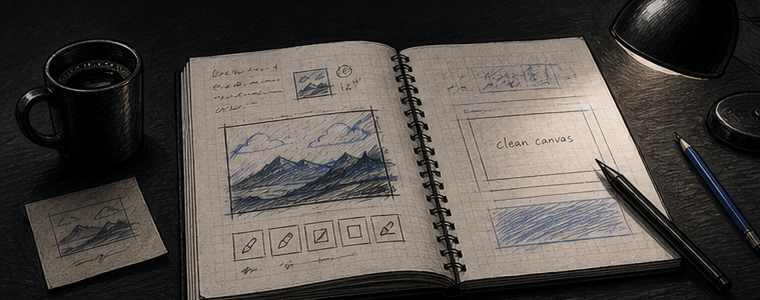
Many desktop image tasks begin with a small need: write down a meeting thought, mark a screenshot, block out a schedule, sketch a rough map, add a label, or make one visual idea clear enough to share. Those tasks are closer to paper than to a formal production workspace.
Those tasks kept feeling heavier than they should. Opening a large app made a small visual thought feel official too early. The interface asked for context before I had decided whether the idea deserved context at all. I did not want a weaker tool. I wanted digital paper that stayed close to the first image.
That is the point where Vincent started. It was not a dream of replacing everything. It was a practical need for a local sheet that could absorb quick visual decisions without turning every decision into a project.
The first sketches were about reach, not decoration.
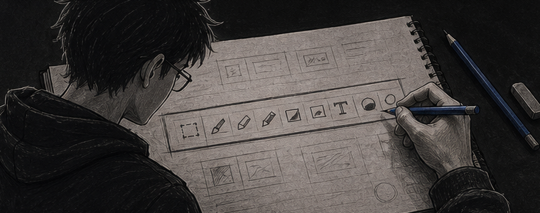
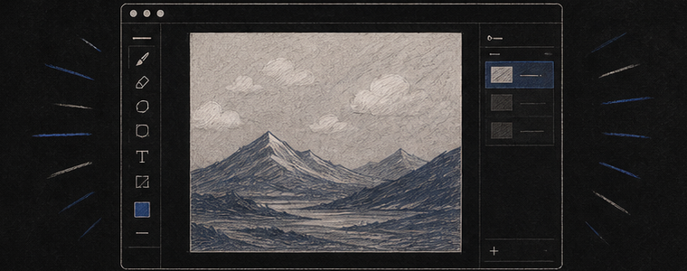
I kept drawing the same toolbar shape in notebooks: a simple strip of tools, a canvas that stayed visually dominant, and enough state to understand what was happening without building a command center around the image. The early question was not which button looked best. It was whether the next useful action could stay within reach.
This is why Vincent has to feel familiar. Digital paper should not need to explain itself for a long time before someone can write, mark, erase, crop, add text, or export. The user should be able to recognize the surface and then discover that it can keep ordinary paper work editable, local, and ready to share.
The file had to remain the center of ownership.
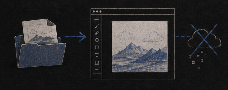
One early decision shaped the whole solution: Vincent should not require a server to be useful. The images people open in Vincent are often unfinished, private, temporary, or simply not worth uploading. A screenshot can include account names. A rough sketch can include a private idea. A small markup can be too casual for a cloud workspace.
Local-first design made the app feel faster before any performance optimization. The user opens a file, changes it, exports it, and decides where the result goes. The app does not need to create an account relationship before it can draw a line. That reduction in ceremony is part of the interface.
The useful version of Vincent is not the app with the most concepts. It is the app that keeps the user closest to the next mark.
The pen response became a test of immediacy.
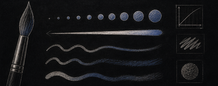
Pen control could not become another heavy panel. Size, opacity, flow, hardness, and spacing matter because they change the feeling of the mark, but the controls only help if they stay understandable. I wanted enough expressive control to make Vincent feel like a serious desktop tool without making every stroke start with setup.
The design work therefore moved between two questions. Does the mark respond quickly enough to feel like the hand is still leading? And can the user adjust the mark without losing track of the image? If either answer was no, the feature needed to be smaller, clearer, or delayed.
The app became digital paper instead of a large suite.
Vincent grew by adding the things that made quick work finishable: local sheets, text, selection, fill, simple shapes, pen feel, crop, rotate, and export. The important part was not the feature list by itself. The important part was keeping those features inside a familiar workflow where the page remained the main object.
That is why I think of Vincent as desktop digital paper and pen rather than a small clone of professional software. It should feel obvious when the task is obvious, and it should have enough depth when the task needs one more layer, one more note, or one cleaner export.
Shipping forced the philosophy to become concrete.
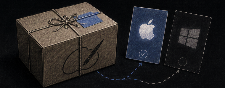
A solution philosophy only matters if it shows up in ordinary surfaces. The store page has to say what the app is. The download page has to explain ownership and platform delivery clearly. The app has to open local files directly. The privacy story has to be understandable without legal fog. Cross-platform support has to be described without making the app feel tied to one desktop environment.
That release work made Vincent less like an experiment and more like a durable tool. A user should be able to buy it, return to the link, download again, and understand that the app is part of their desktop workflow rather than a remote service they have to join.